While we were working as a hard bitten, crack international team of game mercenaries, a logo wasn’t our main concern. But now that we have revealed our game to the world and begun working in a real studio, things like logos suddenly become important. Besides getting sweet tattoos and spray painting our turf, a growing company needs a logo for a lot of things, like a sign on the door for example.
We already had a mock-logo of sorts… The “Blue Manchurian” I designed for the cover of our mock-module covers as seen below:
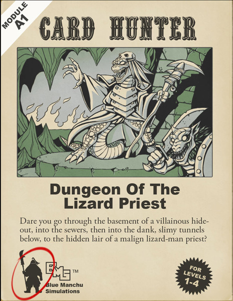
This guy was an early candidate
This character was a tounge-in-cheek replacement for the iconic magic-wielding logo from a certain seminal role playing game from the 1980’s… Jon quite liked him as a logo for the company too. I felt that it was purpose-designed for the module cover and wouldn’t work in a lot of more corporate situations, like on a business card or a t-shirt. I was imagining frosted glass doors in particular when I sketched this next attempt:
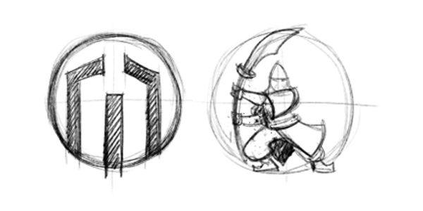
Taking a more corporate direction
The idea was that it was the Manchurian moustache, but also kind of looked like an “M”. We decided that it was TOO corporate. Thinking about shapes, I hit upon the idea of a Chinese stone seal (or “Chop”) as a basis, as seen below:
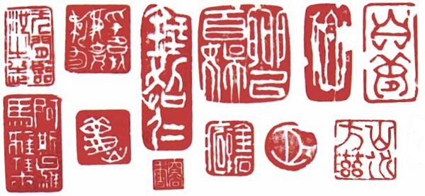
I have been given several of these as gifts over the years…
I really liked the roughness and slight irregularity of this kind of printing and quickly came up with the following rough, incorporating the Blue Manchurian’s head and shoulders into the rectangular shape. The rough came out very close to the final design.
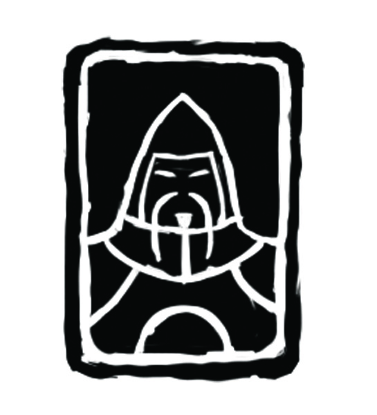
- Quickly freehanded in photoshop using my Cintiq.
Color and layout tests.
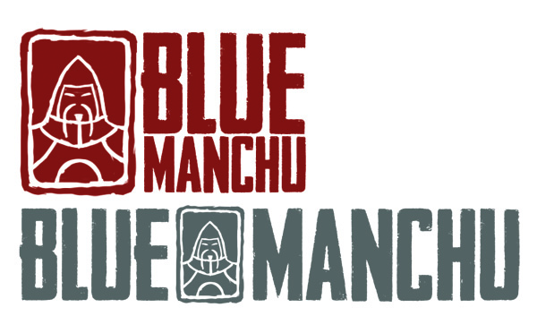
Happy with the direction, all that was left was to painstakingly transform the image into a vector file so it would be easily scale-able for whatever we need it for. Raster images are not much use if you need to make a 100 foot banner one day. Don’t laugh, it could happen!
Here’s the final logo:
![]()
All done!
The first order of business was out door sticker, and the second was our coffee mugs. We both require a cup of freshly made coffee in the morning and were building up a huge dragon’s hoard of used paper cups. The friendly barristas said we could use our own mugs to take a load off the environment, so we had these made:
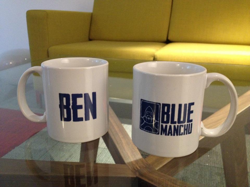
Mmmmm, satisfying!
So there you have it, Cardhunters. You have survived the adventure of the logo design labyrinth… You now have maximum Charisma and company pride +1!

June 8th, 2012 at 8:05 am
That is a really manly logo. I like it a lot. Will the Blue Manchurian be a playable character in Card Hunter? Possibly a dungeon boss?
June 8th, 2012 at 11:34 am
Nah, not a boss… This guy looks more like a questgiver to me. How could the game be complete without an older guardsman-type with a long moustache, whose heart is in the right place but can’t truly understand the mystic chaos that envelops the land?
June 9th, 2012 at 2:00 pm
Anyone else wondering how we can get ourselves one of those mugs?
June 17th, 2012 at 2:13 pm
FFSamurai – I was thinking the same thing.
I would happily pay some denomination of money (cost to produce +10%) to get myself one.
Blue Manchu – Sort it out!
Actually. I’ll take a Tshirt too whilst you’re at it.
Regards
Antony
June 22nd, 2012 at 4:18 pm
When I saw the logo on twitter at first I thought it was some kind of blueprint for a rocket…