Hi, I’m Ben Lee, the Art Director on Card Hunter. My first job in the video games industry was art directing Freedom Force for Jon at Irrational Games several years ago. I did the sequel as well, and Tribes: Vengeance at Irrational. I’ve continued making games since then and have ended up living in the UK. Now I’m working with the rest of our international team on this game.
Last year Jon mentioned that he had an idea for a new game that involved card play and tactical dungeon combat. He wanted a unique look for the project and I jumped right on board. Who wouldn’t?!
Card Hunter: The Early Days
From the outset, Jon had a very clear idea of what the player would be doing while playing Card Hunter. You play a card – you get to move or attack with a game piece. Exactly how we would approach this in terms of the game art was wide open though. While discussing this, we talked a lot about how to lot of our old gaming memories were from the original D&D era (basically for us, the early 80’s) were pretty different to the state of role playing games today. We then decided to see if we could use those memories to conjure up an art style that stood out in the current scene.
My original vision for the game was a very tactile, “mosaic” of the iconic trappings of an early RPG. Graph paper maps, badly illustrated almost home-made looking game books, hand-written character sheets, dice, snacks… The whole bit.
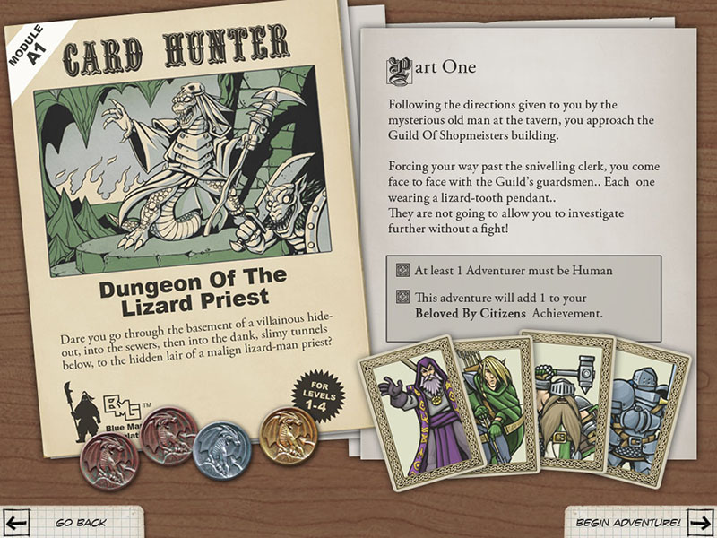
An early concept for the pre-adventure screen
The “module covers” you can see around the site were the first landmarks in the art direction, where we established the exact feel we wanted to evoke. I deliberated a great deal about actually making the game primarily black ink drawings and type on white paper, but abandoned the idea as too arty. Plus Jon likes bright colours and I have to keep him happy.
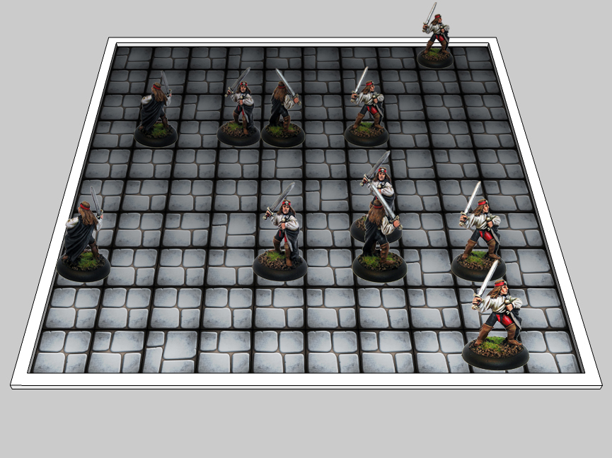
Miniature Models
How to represent the game pieces was a big question. Animated 3d guys? Maybe.. but everybody does that now. Neither one of us is a big fan of having to watch the same animation sequence over and over either. After weighing up a lot of options, we made an early decision that the game pieces would not animate in the traditional sense and would be miniatures of some kind. This fit in nicely with the meta concept of the game being a physical thing made of paper and figures, dice and cards. We were not going to try to visually convince the player that they were looking at a living fantasy world, but that they were playing with a totally awesome Card Hunter Boxed Set.
The next decision was wether to go for 3d models of miniatures. These would give us a lot of options, but did we really need them? For me to be happy with this solution we would need to throw a lot of resources at our renderer and 3D modellers. For a game that was mainly about card play, this wasn’t something I thought was the best way to spend our game budget.
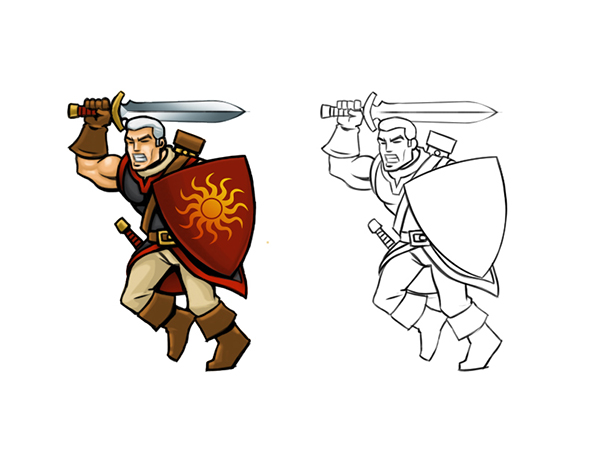
Instead, I got quite excited about using photographs of real metal miniatures and had a go at seeing if they would work.
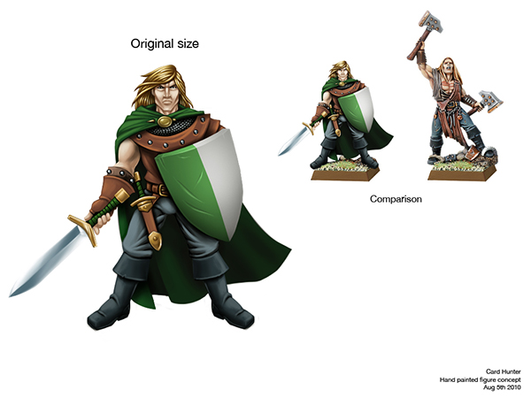
An early test for "fake" miniatures
3D vs Physical Models
Miniatures are a great metaphor for the player to understand and fit the game perfectly. We weighed up the costs of getting our own miniatures sculpted. This was surprisingly affordable compared to having 3D CG models built, but we would need a lot of miniatures for launch, and the effort of coordinating a whole stable of independent sculptors was not going to to be feasible while developing the game as well. We then contacted several miniatures manufacturers looking to licence or otherwise make a deal to photograph an existing line. This, however, was met with general apathy from the miniature companies, which we found surprising.
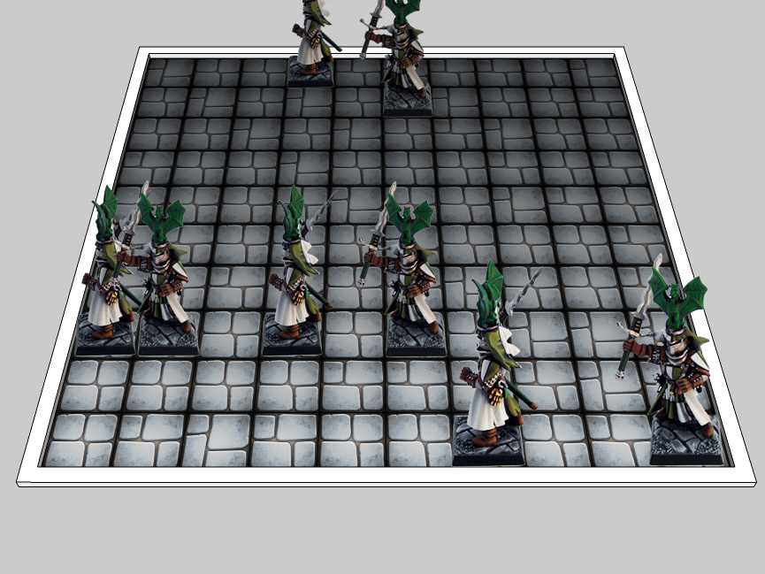
An early concept with a non-isometric map
Round bases proved less problematic with perspective
After a lot of discussion we decided that the risks involved with using 3rd parties for such a central part of our production were too great.We needed something more under our direct control.
We then geared the whole look toward emulating a fancy boxed-set game with deluxe cardboard components.. Meaning flat stand-up miniatures on plastic bases.
The very first Card Hunter Cardboard Miniature
This was particularly fun for me, as it meant using my actual drawings as game art instead of a 3d model inspired by a drawing… Plus it would look exactly like what it was supposed to represent!
The more we tried it, the more right was for the game. Everyone got really excited when we shot the promo video and I built real cardboard figures to send to Kert. Then I knew we had something special. In fact the most stressful part of production was the figure package going missing on it’s way to Canada and the nail-biting quest to find it’s whereabouts.
Good art direction in computer games is, in my opinion, making the best looking art to communicate the essence of the game as immediately to the user as possible, not simply cramming in as much as you can before the crew mutinies. On Card Hunter, we are truly having as much fun making the art as I hope you all do playing the game.

October 18th, 2011 at 6:17 pm
Awesome work, guys! I love the art style! Keep it up! So excited to play this!
October 18th, 2011 at 7:05 pm
Personally I like the old school black and white style shown for the
pre-adventure screen. I don’t think it looks arty. Indeed the lack of color for example is refreshing. Today computer graphics tends to be too colorful and garish.
October 18th, 2011 at 9:43 pm
Great read, I am a freelance artist and actually do graphic art for video and card games. The art style of Card Hunter is one of my primary draws; it takes me back to the good ol’ days of Heroes Quest and the like. Ironically, I change my art direction of a personal project I have been working on for about 2 years now to more closely resemble Card Hunter’s art direction because I love it that much. Like Card Hunter I originally tried to be faking 3d models as in the first concept of the warrior.
Cool guys, we love you!
October 22nd, 2011 at 11:11 pm
Will we have female variations of these figures, ones with darker skin tones, or some kind of customization on these?
December 30th, 2011 at 10:21 am
Love the art of it, actually reminds me a lot of D&D after it crashed into a paint factory lol:)
December 30th, 2011 at 12:53 pm
Thanks for the comments everyone!
We are planning to do male and female versions of all race/class combinations as well as skin tone variants.
Ben
December 31st, 2011 at 12:28 am
Yes having a color palette for our figurines would be a must for all us RPG players who like to customize our characters. Maybe even doing patterns for each figurine as well or hairstyles. Something that would really set apart all players from each other. That way each figurine may represent their player.
May 25th, 2012 at 5:55 pm
Fantastic style, entirely amazing choice.
June 15th, 2012 at 2:54 am
i wish there is expantion pack where they slowly add the new kind of material you can find now for rpg, maybe something that using some 3d miniature model ( it would reeeally fun seeing a really complex 3d model around the carboard pieces that we find now) the adventure packs with the modern art style of the books could look cool, and maybe a ipad like tablet in place of the paper map
October 28th, 2015 at 7:40 pm
For what it’s worth, having played the game for a week before reading this, I can’t help the feeling that the game would lack some of its charm if you went for 3D models or even metal figurines.
Cardboard cutouts fit much better to the overall tone and design of Card Hunter.
In a world of near-universally flashy RPGs, featuring paper figurines in a PC video game is not unlike Warhol putting on exhibitions with soup ads.
Great choice folks!