This week I want to take a bit of a step back from discussing game mechanics and talk a little bit about us and how we’re developing this game. I think it will be a good introduction for some diaries that are coming soon where we introduce some major parts of the game that we haven’t talked about yet and where we feature a special guest appearance from Skaff Elias talking about his and Richard Garfield’s involvement in the project and some of the stuff they’ve been helping out with to date.
If you’ve bothered to read any of the team bios you know that most of us here at Blue Manchu have been working in the industry for quite some time and generally on big “AAA” titles for PC or console. In my case, the biggest project I’ve worked on was BioShock with over 100 people spread among many different offices. My job, as Director of Development, was to coordinate the efforts of our Canberra and Boston offices as well as the help we got from 2K’s Shanghai studio, the head office in New York, the QA department in Los Angeles, the European localisation team and all kinds of other people.
That kind of big project planning requires organisation, discipline and foresight – all things we’ve decided to chuck away for this project.
Instead, we have two main organising principles:
- We don’t try to plan too far in advance. We have a big picture idea of where we’re going (“let’s make a cool collectible card game / fantasy RPG hybrid where you don’t have to buy the cards”) and some rough ideas about how we’re going to get there, but otherwise we try to just focus on immediate objectives rather than projecting a long way into the future. At any one time, we’re working on a very rough milestone which just gives us a basic idea of what our current focus is. For example, right now our milestone is defined to be “get the adventuring and loot system working”. That informs everything else that we do. I have an idea in my head about what the next milestone will be, but I don’t spend too much time worrying about exactly what it will involve. We’ll figure that out when we finish this one.
- Everyone on the team is self-organising and self-motivated. That means we don’t have to write out lengthy specifications for how things are to be done – we just hand out tasks at a really high level. Like “hey Tess, can you keep working on the AI and try to address the list of improvements that we and the test team have come up with?”.
As well as these organisational principles, there’s one other process we stick to and that’s iteration. We always try to do things as roughly as possible the first time so that we can evaluate what we’ve done and then iterate on it to make it better. The secret is that you must do things in a quick and dirty way the first time around, not just because that makes it faster, but because then you get less attached to what you have done. If you do spend a long time making a really nice polished first pass on something, it’s always really hard to admit that it isn’t right and should be chucked away.
I’m now going to pull back the curtain and show you some examples of this sort of iteration in practice. Be warned – this could get ugly. I take the “don’t make things look nice until they are finished” principle very seriously. Sometimes I deliberately make things ugly to avoid getting attached to them!
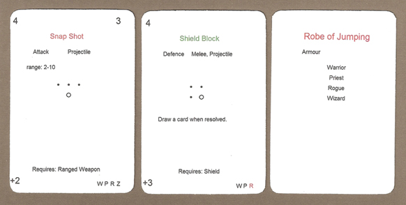
What the #!@&$&! are these?!?
These are cards that I actually printed out onto blank punch-out card sheets. They were used in the very first round of play testing that we did.
I’m not going to go into a great deal of detail about what these cards mean. I might mention one thing though – see the dots in the middle of the two cards on the left? Those were an early idea for showing which directions you could target with the card. The big dot is you – the character playing the card and the little dots are the nine directions around you. So the Snap Shot card on the left can be shot directly forwards or forward to the left or right. The Shield Block can defend against attacks from the front, diagonally to the front and left and directly left, presumably because you carry a shield on your left arm. It was kind of a fun little system but way too fiddly and got dropped pretty early on. That’s what ugly play testing is for! If I’d asked Ben to spend hours making that system look nice I would have had much more trouble letting go of it when I did.
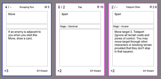
Now look at these cards.
Yeah, just as ugly, right? But these are a big step forward in terms of both game technology and how much work they were to create. These are images that we used for a board game tool called Vassal. Vassal is an awesome engine for playing board games online. It’s also great for prototyping, like we were doing. You can load images into Vassal and it handles moving cards and pieces around but it doesn’t enforce any games rules. This is great of prototyping because you can just agree to try out a new rule without having to code it up. Also, once we had a version of the game in Vassal, I could play a game against Dorian in Boston or Ben in Brighton – which, living in Australia, I obviously couldn’t do with the paper version.
You might recognise some of these cards from our card previews. They’re much closer to what we have now than the paper ones. But there was still plenty of iteration to do on them.
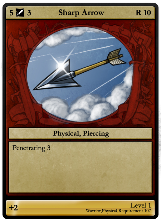
Now I’m going to show you one final thing. This is a card mockup taken from the process where we turned the corner and started iterating on the look of the cards instead of how they worked.
Although it looks nice, this image is a good example of how you can waste time by refining too early. After we made it, we changed several important parts of the game and that meant we had to throw away real work by a real artist instead of my quick mock-ups. But the things we changed were important and, in the next few weeks, we’ll talk about some of those changes and why we made them.
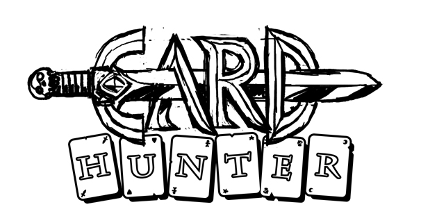
By the way, the logo at the top is one of six that we generated before picking the real Card Hunter logo! Which one do you like more?


September 7th, 2011 at 12:14 pm
Awesome process.
Honestly, I prefer the discarded logo over the one you actually picked.
September 7th, 2011 at 2:47 pm
I hired an artist to do a couple of mock ups for a card game I’ve been working on. It was expensive and put me no closer to having a finished game. But I have two really bitchin’ looking cards so far!
September 7th, 2011 at 8:24 pm
Really enjoyed this article. The idea of making first drafts ugly specifically to avoid attachment was actually a bit of an eye-opener for me.
Many thanks!
September 7th, 2011 at 8:47 pm
Great article. I like your attitude of not getting too attached to drafts.
I like your current logo. The discarded one looks too much like Conan the Barbarian.
September 7th, 2011 at 9:00 pm
Great stuff, I’m a big fan of iterative development and “waiting until the end to make it look good” myself.
I thought I’d weigh in and say that I too prefer the original logo – it’s a more bold, striking, and memorable style IMHO.
September 7th, 2011 at 11:43 pm
I have to say I like the discarded logo better.
September 8th, 2011 at 4:22 am
What you are doing and proposing sounds great!
Please don’t listen to criticisim from people who have not played the game!
September 8th, 2011 at 5:35 am
I’m gonna put in a vote for the current logo. I like that it features a creature instead of a weapon, and having the word with fewer letters written in cards strikes me as less cheesy.
September 8th, 2011 at 6:31 am
Thanks for posting this Jon. Its nice to see how you guys do things internally. Hope there are more of these to come!!!
September 8th, 2011 at 9:04 am
I must add myself to the list of the people who like the discarded logo more than the actual one. But they are both good.
September 8th, 2011 at 12:44 pm
Great Article!
I love the arrow card, too bad you had to change it, I hope the art gets used in the actual game somehow.
Also, The Sword Logo is neat, I’d like to see other variants you had! maybe you could work the sword into the current logo if other’s think is cool too.
I’m both a game designer wannabe and an artist so I’d like to see more of the art of these cards, maybe the artist’s process for coming up with those cool final desings after you guys create the card’s description.
Keep up the good work! (and keep us posted 😉 )
September 8th, 2011 at 3:30 pm
like the card hunter writing on top logo but think having the sword point down threw it instead of dragon would be better after all were going to be the characters not the monsters……right? (secretrly chuckles at thought of playing a goblin…er i mean dragon)
September 8th, 2011 at 7:50 pm
Interesting to see that a lot of you like the sword logo. I liked both of them (I pretty much like everything that Ben does).
I think I’ll put up all the logo ideas he came up with and ask you to vote on them to see which you would have chosen.